


Listen to this post: AI-generated images vs stock photos: when to use each (without losing trust)
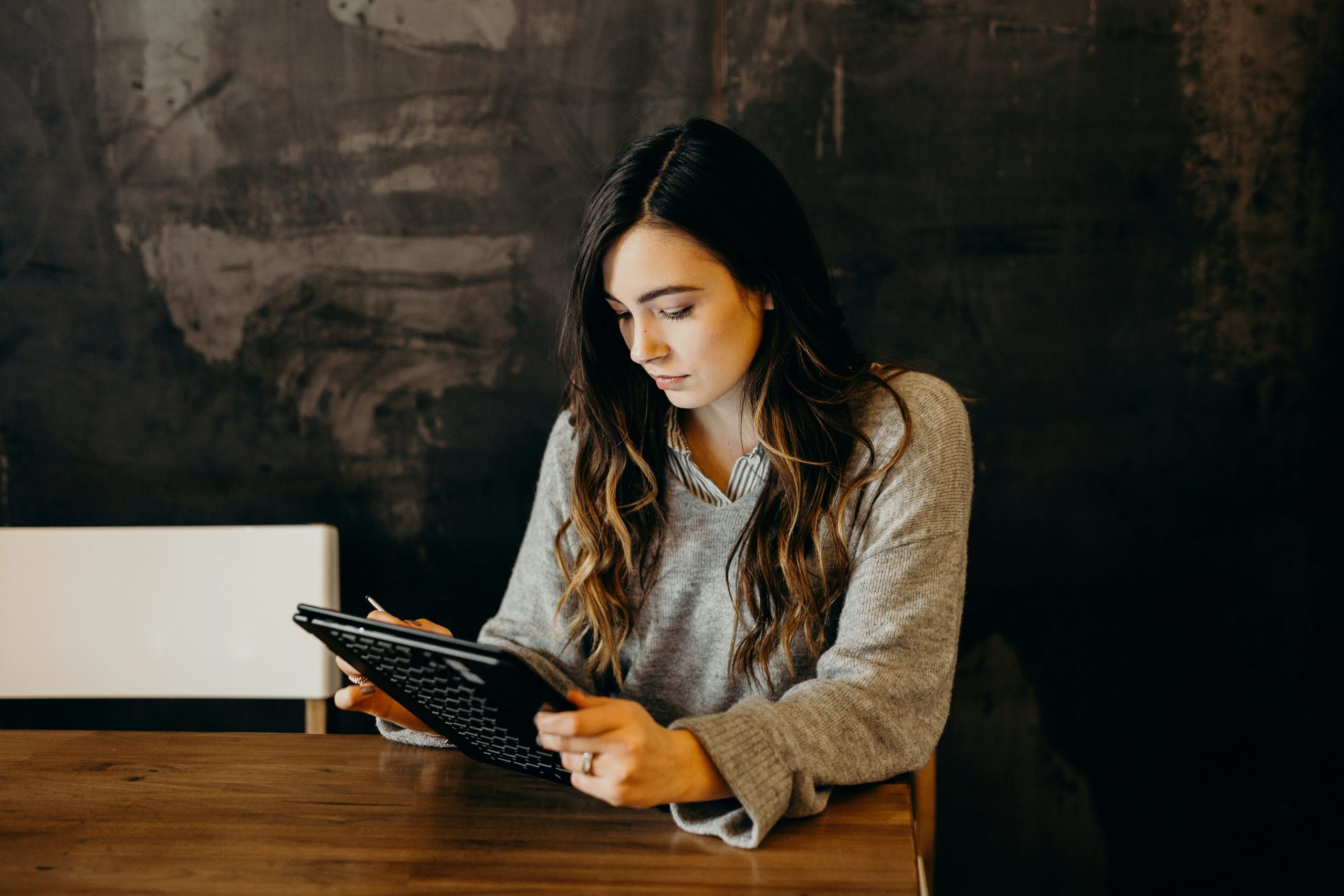
It’s 4:47pm. The brief is half-written, the headline’s in place, and the page still looks bare. You don’t need ten images. You need one strong image that carries the story.
That’s where the choice bites: AI-generated images (made from a text prompt) or stock photos (shot by real photographers, licensed for use). Both can work, both can fail, and the wrong pick can make a serious post feel flimsy.
Here’s the rule of thumb that holds up under pressure: choose the image that fits the risk, the budget, and the story. This is written for CurratedBrief-style work, quick news briefs, explainers, newsletters, and social cards where speed matters, but credibility matters more.
AI-generated images vs stock photos: the real differences that matter
Most “AI vs stock” debates get stuck on cost or novelty. In practice, the differences you feel as a publisher are simpler: realism, speed, control, and trust.
Realism is about the viewer’s gut reaction. A stock photo of a tired commuter has tiny details, uneven light, real skin texture, a slight blur from movement. AI can mimic that, but it often slips into a smooth, polished look that feels staged, even when it’s meant to look candid.
Speed is obvious. AI can produce options in seconds. Stock is fast too, but it’s a different kind of fast. You’re searching, filtering, checking licences, checking faces, checking background logos, and hoping you find “close enough”.
Control is where AI shines. If you need a fintech app hero image with a specific phone angle, a specific hand position, and a specific background colour, AI can usually get you there. Stock can’t, because the photo already happened.
Trust is the big one. If your image could be read as proof, stock tends to win because it’s anchored in reality and licensing is clearer. AI can be honest, but it can also look like a real photo while showing something that never occurred.
Ground it in three common cases:
- Fintech app hero image: AI works well if you want a clean, brand-matched concept that isn’t tied to a real bank or real person.
- Health explainer: stock is safer when the viewer might take the image as medical evidence, or when human anatomy needs to be correct.
- Breaking-news thumbnail: stock (or agency editorial photos) is the safer default, because AI “news-like” images can mislead, even when the text is careful.
Both options have signature flaws. AI can produce odd hands, strange teeth, mushy jewellery, and unreadable text. Stock can look overused, like the same handshake, the same “laughing in a meeting” scene, the same glossy office.
A simple memory hook: AI is a sketchpad, stock is a receipt. AI is great for ideas and mood. Stock is stronger for proof and trust.
| What matters | AI-generated images | Stock photos |
|---|---|---|
| Speed | Instant options | Fast search, slower selection |
| Control | High, you can steer details | Limited to what exists |
| Real-world feel | Can feel synthetic | Real texture and emotion |
| Trust risk | Higher on sensitive topics | Lower when used correctly |
If you want a broader comparison, this overview of AI image generators vs traditional stock photos is useful context.
Speed, cost, and control: what you gain and what you trade
On a tight deadline, AI feels like a vending machine. Put in a prompt, get options. That speed can change how a newsroom or content team works.
But speed isn’t the only cost.
Turnaround time
- AI: you can get 10 to 30 variations quickly, which helps when a brief needs a fresh visual at short notice.
- Stock: you spend time searching, and time is money when you’re publishing daily.
Cost patterns
- AI tools often sit behind a subscription or credits.
- Stock can be subscription-based too, or per-image licensing, which adds up on high-volume weeks.
The hidden cost is rework. If AI gives you an image with strange fingers, you might spend longer fixing it than you would have spent finding a stock alternative.
Control AI lets you ask for “the same scene but warmer light”, “swap the background to a soft gradient”, or “remove the logo on the laptop”. With stock, you can crop and grade, but you can’t change the core scene.
Consistency across a series If you’re running a week of explainers, AI can keep a steady style, colour palette, and framing. Stock can match too, but it takes more searching, and sets can vary in lighting and mood.
A practical pro-and-con round-up sits in AI images vs stock photos: pros, cons, and best use. Use it as a sense-check, not a rulebook.
Quality and authenticity: why some images feel ‘real’ and others feel ‘off’
Stock photos often win on tiny, human details. Real light behaves in messy ways. Fabric creases. Hair doesn’t line up perfectly. People pull odd faces mid-sentence. Those flaws are part of the truth of an image.
AI tends to smooth those edges. Even when the output looks “photographic”, it can feel like visual elevator music, pleasant, safe, and a bit blank. That’s not always bad. For an abstract tech brief, blank can be ideal. For a human story, blank can feel cold.
If you’re using AI, watch for these “off” signs before you publish:
- Hands and fingers: extra digits, fused fingers, odd joints.
- Teeth: too uniform, too many, strange spacing.
- Jewellery and glasses: melted shapes, mismatched reflections.
- Background text: nonsense letters, broken signage, fake brands.
- Logos and products: accidental lookalikes, warped trademarks.
- Reflections: mirrors and windows that don’t match the scene.
Even a good AI image can fail at 1200px wide on a laptop screen. Zoom in and check it like you’re checking a quote.
When to use AI-generated images (and when it’s a bad idea)
AI images are strongest when they’re clearly illustrative, concept-led, or brand-led. They struggle when the viewer expects a record of reality.
Think of your image like a headline. If it implies something that didn’t happen, you’ve created friction, even if the article is accurate.
In 2026, more publishers are using AI for speed and custom looks, but many still keep stock for realism and trust, especially on sensitive topics. That matches what agencies and creative teams report, AI wins on quick custom work, stock wins when credibility is the point.
Best use cases for AI images: custom concepts, prototypes, and repeatable styles
AI helps when the story is about an idea, not a person.
Good fits for AI-generated visuals:
- Abstract tech concepts: AI, cyber security, quantum computing, data privacy.
- “Impossible” scenes: metaphors like a paper boat in a storm to represent market volatility.
- Placeholder art for drafts: a quick image to get approvals moving.
- Background textures and simple shapes: subtle patterns for social cards.
- Icon-like illustrations: simple, consistent visuals across a series.
- A repeatable visual system: the same style for a week of briefs or a month of explainers.
A mini workflow that works well under deadline pressure:
Prompt: write one sentence on subject, mood, and style.
Generate: create 10 to 30 options quickly.
Pick: choose the one that reads cleanly at thumbnail size.
Fix: correct small issues (crop, colour, remove obvious artefacts).
Export: prepare sizes for web, newsletter, and social.
If you’re building a brand look with AI, keep a prompt log. Small tweaks matter, and you don’t want to reinvent your style every week.
For a project-based view of how people decide, this piece on picking the perfect pic for your project offers a helpful framing.
Avoid AI images for high-trust moments: people, health, money, and breaking news
Speed feels good until it costs you trust.
Avoid AI images when the image could be mistaken for evidence, or when a small error could cause harm. The highest-risk areas tend to be:
People: real person stories, interviews, personal profiles, crime, court, and anything where identity matters. AI can accidentally suggest a real person, or create a face that looks like someone.
Health: medical advice, symptoms, treatments, and public health updates. Anatomy errors can look minor but can undermine the whole piece.
Money: warnings about scams, bank issues, credit, and investments. A “photo-like” AI image can feel like a staged advert, or worse, like a fake proof point.
Breaking news: politics, conflict, disasters, and live events. Even if you label it, a realistic AI image can spread faster than your correction.
A clean line to use in editorial meetings: if readers might assume it’s a real photo, think twice. Pick stock, agency editorial, or a clearly illustrative graphic instead.
For a wider discussion of where the future might land, this article on AI image generation vs stock photography is a useful read.
When to use stock photos (and how to stop them looking generic)
Stock photos are still the safest option when you need the viewer to feel grounded. They also give you clearer licensing pathways and model releases, which matters when faces are involved.
The downside is familiarity. People can smell clichés. A bland stock photo doesn’t just look boring, it signals that the content might be thin, even when it isn’t.
Stock works best when you treat it like casting, not decoration. You’re picking a scene that matches the message, not filling space.
Best use cases for stock: real faces, real places, and credibility you can feel
Stock is a strong choice when the story needs real-world weight:
- Team culture and workplace stories: real expressions beat synthetic smiles.
- Events and communities: place-based images anchor the reader quickly.
- Products in use: especially when you’re showing real hands interacting with real items.
- Customer stories and human interest: authenticity matters more than novelty.
- Travel and local guides: the textures of a real street or coastline are hard to fake well.
Licensing also tends to be easier to explain. In plain terms, you’re paying for permission to use the image under certain rules, and many images that include people come with a model release (documented consent for use). That doesn’t remove every risk, but it reduces surprises.
How to choose better stock: reduce clichés, improve fit, and edit with purpose
You don’t need rare stock. You need the right stock.
A simple method that improves quality fast:
Start with mood and message
Write three words for the feeling you want, like “calm, precise, human”. Use those words as your filter.
Search with detail, not themes
Instead of “business meeting”, try “two colleagues laptop afternoon window light”. Add age, setting, emotion, and lighting.
Avoid overused poses
Skip forced high-fives, staged pointing, and perfect grins. Look for “in-between” moments, a glance, a pause, a hand mid-gesture.
Check the background
Look for brand names, readable text, and screens that could cause problems. Also check for accidental stereotypes.
Edit with purpose
A few small edits can make stock feel like it belongs on your site:
- Crop tighter for energy.
- Pull back saturation if it looks too glossy.
- Add a touch of natural grain if the image feels plastic.
- Keep skin tones believable.
You can also mix stock with light AI elements, like a simple abstract background for a quote card. Keep it honest. Don’t combine elements in a way that suggests a real event that didn’t happen.
Rights, licensing, and ethics: a simple risk checklist before you publish
“Free to generate” doesn’t mean “free of risk”.
Whether it’s AI or stock, the same basic rule applies: if you can’t explain where the image came from and why you’re allowed to use it, it’s not ready.
Two risks show up often:
Commercial rights: can you use it in a newsletter, on social, in paid ads, or on a sponsor page?
Misleading context: does the image imply facts you can’t back up?
This is where good publishing habits beat clever tools.
Licensing basics for stock vs AI: what to check every time
For stock, check:
- Licence type: standard vs extended (extended often covers higher-volume or resale-like uses).
- Usage limits: print runs, product use, and distribution caps.
- Sensitive use rules: some licences restrict use around health, politics, or adult themes.
- Model release: especially when faces are clear and central.
For AI, check:
- Tool terms: does the platform allow commercial use, and under what conditions?
- Trademark lookalikes: AI can invent logos that resemble real brands.
- Lookalike people: avoid images that could be read as a real person, even by mistake.
Keep a simple record for every image: source, date, licence type, and where it’s used. That one habit saves hours later.
Ethical publishing: avoid misleading readers and protect your brand trust
Ethics is less about grand statements and more about small choices made quickly.
Label AI images when it could mislead, especially:
- News-style visuals of events.
- Human subjects that look like real portraits.
- Anything that could be shared out of context as “proof”.
Also watch for bias. AI can default to stereotypes, or flatten diversity into a bland average. Stock can do this too, but AI can repeat the same patterns at scale if you don’t correct it.
A short trust test helps: if the image could change how someone feels about a real person or event, use a real photo, or a clearly illustrative graphic that can’t be mistaken for evidence.
Conclusion
The blank page problem won’t go away, and neither will the need for one image that earns attention. AI-generated images are great for speed, custom concepts, and consistent series visuals. Stock photos are best when you need real-world credibility and fewer surprises.
Use a final decision rule your team can remember: need reality and trust, choose stock. Need a custom concept fast, choose AI. High-risk topic, choose the safest, clearest option, even if it takes longer.
Build a small image playbook for your workflow, when to use AI, when to use stock, and when it’s time to commission original photography or illustration. That’s how you publish quickly without training your audience to doubt what they see.