


Listen to this post: How to Optimise Your Blog for Mobile Readers in 2026
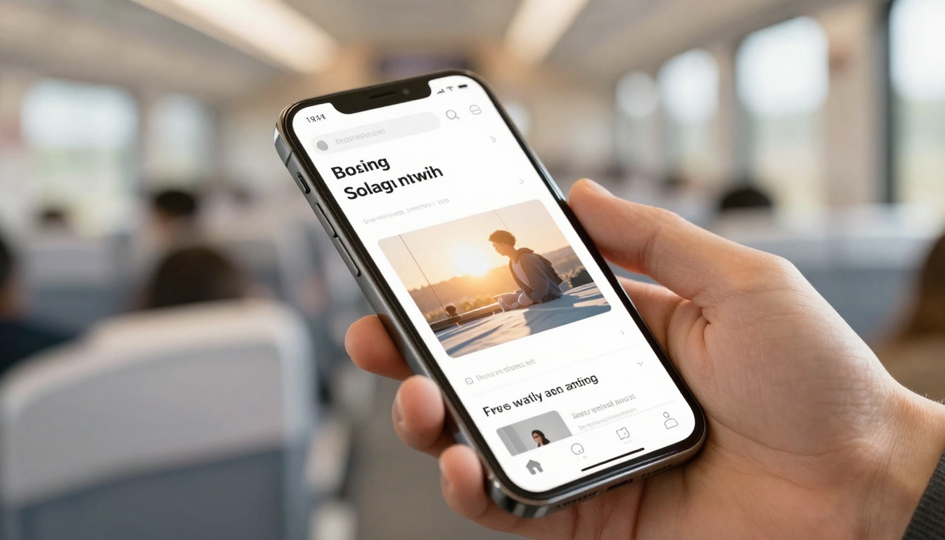
Picture a reader on a phone: one hand scrolling, sunlight bouncing off the screen, tiny text fighting for attention. They’re not settled at a desk, they’re waiting for a train, half-distracted, and quick to leave if your page feels hard work.
That’s why mobile matters. Mobile devices now account for roughly 60 to 62 percent of global web traffic, which means most new readers meet your blog on a small screen first. If the experience feels cramped, slow, or fiddly, they won’t hang around to see how good your writing is.
This post gives you a practical checklist to make your blog easy to read, fast to load, and simple to tap, without turning it into a technical project that never ends.
Make your blog easy to read and use on a phone

Photo by Liza Summer
Mobile comfort is physical. Eyes squint, thumbs slip, and glare makes weak contrast vanish. If your blog feels calm on a phone, readers stay long enough to trust you.
Start with a quick reality check: open your latest post on your own phone, outdoors if you can. If you need to zoom, if you hit the wrong link twice, or if the page “wiggles” while loading, that’s your to-do list.
A few quick wins that often take under 10 minutes:
- Increase base font size in your theme settings.
- Add more spacing between paragraphs.
- Cut any intro that takes ages to get to the point.
- Remove a pop-up that blocks half the screen.
Some changes may need a small tweak in your theme or CSS, but even then, you don’t need to rebuild the site. You’re aiming for fewer obstacles between the reader and the sentence they came for.
Mobile readability rules: font size, spacing, and scannable layout
If readers have to pinch-zoom, you’ve already lost momentum. Aim for body text that reads comfortably at arm’s length. Many blogs land well with 16 px to 18 px body text, but what matters is how it feels on your device, not the number.
Keep the page visually steady:
- Strong contrast: light grey text on a white background looks stylish, but it fades in daylight.
- Short paragraphs: 2 to 3 sentences is a good rhythm on mobile.
- Line length that feels calm: on a phone, extremely wide lines usually happen when your layout isn’t truly responsive, or your font is too small.
Structure posts for scanning, because mobile readers skim before they commit. Use clear H2s that say what the section gives them, then short H3s that signpost detail. A small amount of bold can help someone re-find a key idea while scrolling, but use it like salt, not sauce.
Also, keep the payoff near the top. Put the core answer, takeaway, or step list early, so readers get value above the fold. They can choose to stay for depth once they trust you.
One more rule: avoid walls of links. A paragraph packed with blue underlines looks like a trap on mobile, and it breaks reading flow.
Tap-friendly design: navigation, buttons, forms, and avoiding pop-up pain
A phone is a thumb-first device. Links and buttons need enough size and breathing room to avoid “fat-finger” mistakes. A common guideline is tap targets around 44 by 44 pixels, with clear spacing between nearby links.
Make key actions easy to reach:
- Keep your primary menu simple. A clean hamburger menu is fine if it opens quickly and shows clear labels.
- Consider a sticky header only if it doesn’t steal too much vertical space.
- Add search if your site has lots of posts, because scrolling through categories on a phone gets old fast.
Forms are where mobile friction spikes. If you want newsletter sign-ups or downloads, keep fields to the minimum, use proper input types (email, number), and allow autofill. If your form feels like a tax return, people won’t finish it on a bus.
Pop-ups are the fastest way to annoy mobile readers. If you must use them, delay them, keep them small, and make the close button obvious. And if you run ads, stop them from pushing content down as they load. That “jumping page” feeling breaks trust.
Speed up your mobile pages (because slow pages bleed readers)
Speed isn’t a nice extra. On mobile, it’s the difference between “I’ll read this” and “I’ll come back later” (they won’t).
Mobile readers often have weaker signal, cheaper data plans, and more background apps fighting for memory. When a page loads slowly, people abandon it quickly, and mobile bounce rates tend to be higher than desktop because patience is lower on the move.
If you only do three things this week, do the biggest wins first:
- Fix oversized images (usually the number one problem).
- Reduce scripts and plugins that run on every page.
- Stabilise layout so the page doesn’t jump while loading.
For a broader view of what “mobile SEO” looks like right now, it helps to compare your checklist against an up-to-date guide like mobile SEO best practices for 2026, then prioritise what actually affects your readers.
Hit the Core Web Vitals that matter on mobile: LCP, INP, and CLS
Core Web Vitals can sound like developer talk, but they describe real feelings:
- LCP (Largest Contentful Paint): how fast the main content appears. Target under 2.5 seconds.
- INP (Interaction to Next Paint): how quickly the page responds when someone taps. Target under 200 ms.
- CLS (Cumulative Layout Shift): how much the layout jumps around. Target under 0.1.
When these go wrong, readers feel it. LCP feels like staring at a blank screen. INP feels like sticky buttons that don’t respond. CLS feels like the page moves just as you try to tap, so you hit the wrong thing.
Common causes include heavy hero images, too much JavaScript, and ad slots that load late and shove content down.
Fast-loading checklist: lighter images, fewer scripts, smarter loading
Images are often the easiest speed win. Compress them, convert to modern formats like WebP or AVIF, and make sure you’re not serving a 2,000 px-wide image to a 390 px-wide screen. “Looks fine on my laptop” usually means “wasteful on mobile”.
Next, reduce what the browser has to process:
- Remove unused plugins and widgets.
- Defer non-essential scripts so content can appear first.
- Limit trackers. Each one can add delay, and readers don’t care how many analytics tools you run.
Loading behaviour matters too. Lazy-load images that are below the fold, but don’t lazy-load your main hero image if it’s the first thing the reader should see.
For site owners, caching and a CDN can help pages arrive faster, and compression like Brotli or Gzip can reduce file size. You don’t need to memorise the terms, just ask your host what’s enabled.
A practical tip for writers: treat embeds like luggage. Every heavy embed slows the page. If you don’t need the full embed, use a simple link preview or a single screenshot instead.
Protect your mobile SEO in 2026 (mobile-first indexing and real testing)
Mobile-first indexing is not a future trend, it’s the default. Google mainly evaluates the mobile version of your site, so if your mobile view hides content, removes links, or strips structured data, you’re telling search engines a smaller story than you meant to.
This is where many blogs stumble. Desktop looks great, but mobile has collapsed sections, missing images, or “read more” blocks that hide the best bits. Readers notice, and search engines do too.
If you want a wider strategy view (beyond design and speed), this 2026 guide to blogging is a useful reminder that clarity, trust, and usability sit right next to keywords now.
Mobile-first indexing basics: keep content and structured data the same on mobile
Don’t treat mobile as a trimmed-down version. Keep your key paragraphs, headings, images, internal navigation, and schema consistent across devices. Responsive design usually makes this easier because it serves the same content and adapts the layout.
Also, don’t block CSS, JavaScript, or images in robots.txt. If Google can’t load what a user sees, it can misread your layout and miss key signals.
If your mobile version is thinner than desktop, rankings can slip because the mobile page is what gets judged first.
Test like a real reader: what to measure, which tools to use, and how often
A simple routine beats an occasional panic overhaul. Each month, test one key post and one category page. Also test after any theme, plugin, or ad changes.
Use PageSpeed Insights and Lighthouse to check Core Web Vitals, then sanity-check on real devices. For real-user monitoring, tools like Firebase Performance Monitoring can show how the site behaves outside your Wi-Fi bubble. If you expect traffic spikes, load testing tools like JMeter or BlazeMeter can help you see what breaks under pressure.
Test on Android and iPhone, and try a slower data mode once. Your site should still feel readable and stable.
Final pass checklist:
- Tap targets feel easy
- Scroll is smooth
- Images don’t “pop” the layout around
- No surprise pop-ups
- Reading feels calm for 30 seconds straight
For writing that supports mobile scanning as well as search intent, this guide on SEO-friendly blog post structure can help you tighten headings and flow.
Conclusion
Mobile readers don’t want a “mobile experience”. They want your content, with comfort, speed, and zero friction. Make text easy to read, make pages quick to load, and make every tap feel safe.
Pick three changes today: one readability fix, one speed win, and one test you’ll repeat next month. Do the same next week, and your blog will start to feel like it was built for the way people actually read now. Keep earning trust, one smooth scroll at a time.