


Listen to this post: How to Edit Basic Photos on Your Phone (iPhone Photos and Google Photos)
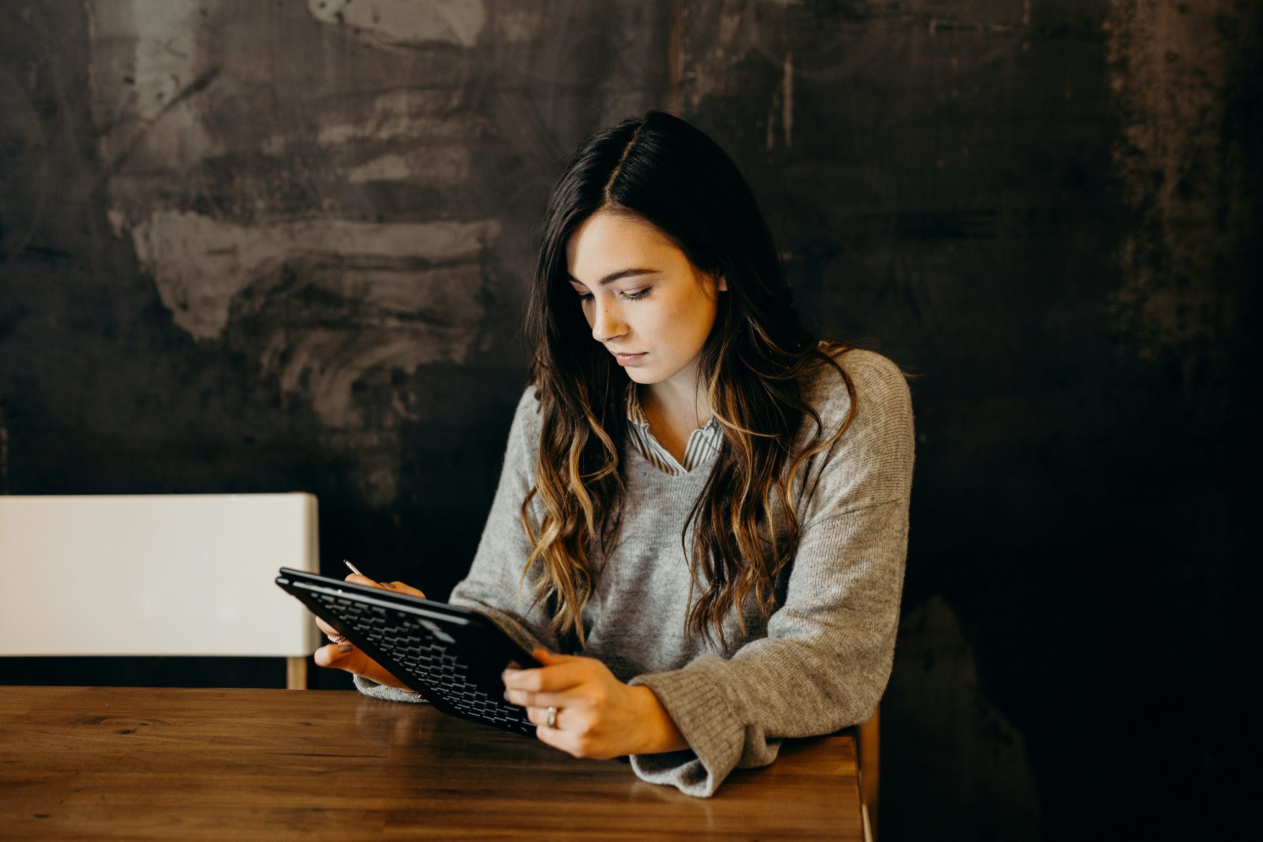
You take a quick photo on the bus. Or at a gig, arm stretched, lights flashing, mates laughing. On your screen it felt alive, but the photo looks… flat. A bit dark, a bit crooked, and somehow not how it felt.
The good news is you don’t need a fancy app or a laptop to fix that. With basic photo editing on your phone, you can make pictures look cleaner and brighter in under a minute, using tools you already have. Think: crop, straighten, light, colour, sharpness, and small touch-ups. Not pro retouching, not “perfect skin”, just a photo that matches what you saw.
This approach works in both iPhone Photos and Google Photos, with small changes to button names and where tools sit.
Start with a clean plan, one good photo beats ten edits
Editing is a bit like seasoning food. A pinch can lift the whole dish, but too much ruins it. The goal is simple: make the photo look like the moment, not like a filter did the heavy lifting.
If your app offers it, edit a copy so the original stays safe. On iPhone Photos, edits are non-destructive (you can revert later), but it’s still smart to work carefully so you don’t paint yourself into a corner.
A reliable order keeps you from bouncing around sliders and overdoing it:
- Straighten and crop
- Fix light
- Fix colour
- Finish with detail (sharpness, small distractions)
Small changes stack fast. Move sliders in tiny steps, stop often, and compare to the original so you can feel when it’s “enough”.
Pick the best shot first (focus, blur, and clutter)
Before you edit, choose the photo that has the best bones. Editing can polish, but it can’t rebuild.
A quick checklist:
- For people, make sure eyes look sharp, not smeared.
- Avoid strong motion blur (hands, faces, moving cars).
- Check the horizon isn’t wildly tilted.
- Look for fingers over the lens or smudges.
- Make sure the main subject isn’t chopped off (feet, hair, signs).
If you’ve got two similar photos, pick the simpler frame. Less clutter means less fixing later. And if the whole image is heavily blurred, don’t waste time fighting it. Choose another shot.
Use the built-in compare and undo tools so you don’t overdo it
Most phone editors let you see the “before” with a simple gesture. Often you can tap and hold on the photo while editing to preview the original, then release to return to your edits.
Undo is your safety net. Revert is your emergency exit. Use them. Comparing stops the classic beginner problem: pushing every slider until the photo looks crunchy, overly bright, and oddly coloured.
On iPhone Photos, Apple notes you can tap the photo while editing to compare changes, which is a quick way to stay honest about what you’ve done.
Fix the shape first, crop, straighten, and tidy the frame
Framing edits come first because they change what the viewer looks at. If the horizon is off or the edges are messy, even great colour won’t save the feeling.
Simple composition fixes that work for almost any photo:
- Cut distractions at the edges (bins, signs, stray elbows).
- Leave a little space in front of a moving subject (a runner, a car, a dog).
- Keep horizons level, especially in sea and city shots.
If you post on social platforms, these crop ratios come up a lot:
- 1:1 for square posts
- 4:5 for Instagram feed posts (fills more screen space)
- 9:16 for Stories and Reels
Even if you don’t post, choosing a ratio can help you commit to a clean frame.
Straighten and rotate to stop photos looking ‘off’
A slightly tilted horizon can make the whole image feel wrong, even if the subject is great. Your brain notices it, like a crooked picture frame on a wall.
In iPhone Photos, tap Edit, then the crop icon, then use the straighten dial to level the horizon (Apple places crop and straighten together). Many apps also show a grid, which makes it easier to line up lampposts and buildings.
Straighten first, then rotate only if the camera has truly flipped the shot. Rotation is a bigger move, straighten is the gentle fix.
Crop for impact without chopping off important details
Cropping is where most “meh” photos become shareable. You’re telling the viewer what matters.
Practical crop rules that keep you out of trouble:
- Portraits: don’t crop at joints (wrists, ankles). Keep hair and chin intact.
- Food: centre the hero item, remove table clutter and stray cutlery.
- Landscapes: level the horizon, reduce empty sky if it’s dull.
- Screenshots: trim borders and dead space so the key info fills the frame.
After you crop, zoom out and scan the edges. The corner of a bin, a bright sign, or half a face can pull attention away more than you’d think.
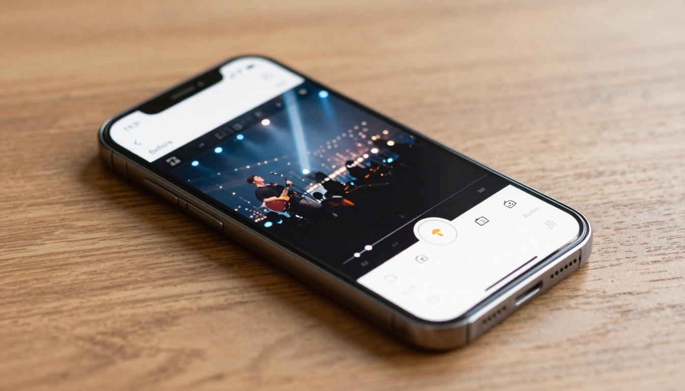
Make it brighter and clearer, simple light edits that work every time
Light edits are the biggest win for beginners. Most “flat” photos are simply underexposed, or have harsh highlights and muddy shadows.
Where to find the tools:
- iPhone Photos: open a photo, tap Edit (the sliders icon), then use the adjustment controls.
- Google Photos: open a photo, tap Edit, then go to Adjust (naming can vary by version). For up-to-date steps, Google’s own guide is useful: Edit your photos in Google Photos (iPhone and iPad).
The key is restraint: move one slider, stop, compare, then continue.
One-tap Auto first, then small tweaks
Auto (or Suggestions) is a great starting point. It often lifts exposure, balances contrast, and nudges colour into a nicer place.
Treat it like a rough draft, not the final word. If Auto makes skin too orange, or shadows too heavy, reduce the strength (many apps let you tone it down) or undo and do it yourself with two or three small slider moves.
Exposure, highlights, and shadows, the easy way to rescue bad lighting
These three are your rescue crew. Each does a different job:
- Exposure: lifts or lowers the whole photo.
- Highlights: pulls back detail in bright areas (sky, shiny foreheads, white shirts).
- Shadows: lifts dark areas (faces in shade, coats, hair detail).
A safe method:
- Nudge exposure until the photo feels “awake”.
- Pull highlights down if the sky looks blown out or lights look harsh.
- Lift shadows to bring back faces and detail in dark parts.
Be careful with exposure. Push it too far and you’ll get washed-out faces and visible grain, especially in low light.
Examples to look out for:
- Backlit faces (window behind someone): lift shadows first, then a touch of exposure.
- Night photos: avoid big exposure jumps, use shadows gently and accept some darkness.
- Bright windows: reduce highlights so the window isn’t a white hole.
Brightness and contrast, add punch without harsh edges
Brightness is overall light. Contrast is the gap between light and dark. Too much contrast can make edges look harsh and skin look rough; too little can make the photo look grey.
A calm approach that usually works:
- Add a small amount of contrast for shape.
- Then adjust brightness to taste.
On iPhone Photos you may also see Brilliance, which can add a pleasing “pop” without you juggling as many sliders. Use it lightly. If the photo starts to look crispy, back off.
Here’s a quick cheat sheet for common light controls:
| Control | What it changes | What to watch for |
|---|---|---|
| Exposure | Overall light level | Grain and washed-out highlights |
| Highlights | Bright areas detail | Grey, dull skies if overdone |
| Shadows | Dark areas detail | Flat, “foggy” look if pushed hard |
| Contrast | Separation of tones | Harsh edges, blocked shadows |
| Brilliance (often iPhone) | Balanced lift and punch | Over-sharpened feel if too strong |
Colour and finishing touches, keep it natural, keep it sharp
Once the frame is tidy and the light looks right, colour becomes easier. If you try to fix colour before light, you often end up chasing your tail.
A good rule is to aim for believable whites and healthy skin tones. If a white wall looks yellow, your warmth is too high. If grass looks neon, saturation is too high.
If you want a deeper iPhone-specific walk-through, this beginner guide is a solid reference point: Complete iPhone Photo Editing Guide for Beginners. For a written overview with practical examples, Popsa also has a helpful post on iPhone post-processing: iPhone Photo Editing: Essential Post-Processing Guide.
Saturation and warmth, fix dull photos without turning them orange
Two sliders do most of the colour work:
- Saturation: boosts colour strength.
- Warmth: shifts colour towards yellow/orange (warm) or blue (cool).
A simple test that saves you from weird colour:
- Look at something that should be neutral (a white shirt, a grey wall).
- Look at skin. Skin is the first place “too warm” shows up.
Landscapes can handle a touch more saturation, especially greens and blues. Faces usually can’t. If people start to look sunburnt, pull warmth or saturation back.
Filters and sharpness, a light finish that still looks real
Filters are quick style, but they can also stamp the same mood onto every photo, even when it doesn’t fit. If you use them, keep the strength low so the edit still looks like your camera.
Sharpness (sometimes called definition) can make details look crisp, but it’s easy to go too far. Over-sharpening creates halos around edges and makes skin look gritty. Add a little, then stop.
Low-light photos are tricky. Heavy edits can bring out noise (grainy speckle). If you notice noise after brightening, reduce sharpness and ease off on shadows. Sometimes the best edit is simply less.
Remove small distractions and save safely (revert, save copy, copy edits)
Little distractions pull focus: a spot on a wall, a crumb on a table, a random passer-by at the edge. Whether you can remove them depends on the app and phone model.
- In Google Photos, you may see tools such as Healing or similar options (availability varies by device and version). If you don’t see it, cropping often does the job faster than hunting through menus.
- In iPhone Photos, newer iPhones include a Clean Up tool for removing distractions (Apple has expanded editing features in recent iOS versions, and the tool can highlight items you might want to remove). If you don’t have it, use a crop, or use Markup for tiny, simple cover-ups.
Saving without regret matters more than people think:
- If your app offers Save copy, use it when you’re unsure.
- If you change your mind later, look for Revert (iPhone Photos allows reverting to the original).
- If you’ve edited one photo from an event and want the same look on the rest, many apps let you copy edits and paste them to similar shots. On iPhone, you can copy edits from the menu (three dots) and paste to other photos, then check each one and tweak, because light changes from frame to frame.
Conclusion
A photo doesn’t need magic to feel good again. A quick crop, better light, and gentle colour can turn a flat shot into something you actually want to share. Keep the order simple: straighten and crop, fix light, adjust colour, then finish lightly with sharpness and small clean-ups. Practise on three photos today (a face, a food shot, and a sunset), and keep changes small so the picture still feels like you.